Possible Legion Cloak Emblem
Posted: Sun Feb 17, 2013 10:11 pm
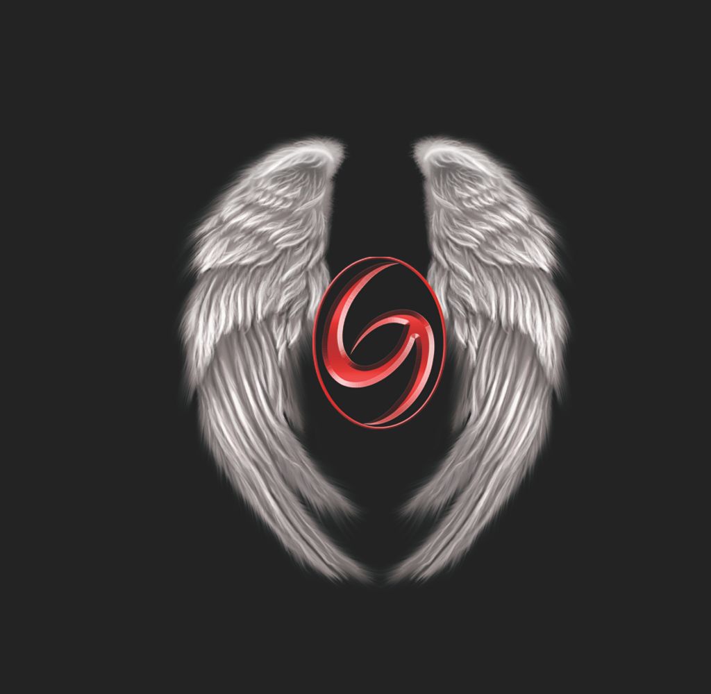
I put this image together to possible use as emblem for our Legion Cloak when we get to Level 3. Let me know what you guys think?
https://forums.grievancegaming.com/
https://forums.grievancegaming.com/viewtopic.php?f=514&t=9824
I was trying to avoid wings that were spread out because of the limited width we'd have on the guild cloaks, the wider the image, the smaller it will shrink down to in order to fit widthwise on the cloaks.Kuniyuki wrote:Nice job indeed. The red and the black fit with each other and to avoid making it dark theme the white wings balance it even though they could be a little more open.
How about this?Lotharen wrote:Looks really good. The only thing I can critique is the Grievance 'G' its self. Could you possibly soften it a little? Its so crisp and clear, where the wings are very soft and 'whispy'? It would help them appear to be together more....if that makes sense lol.
Looks great though!
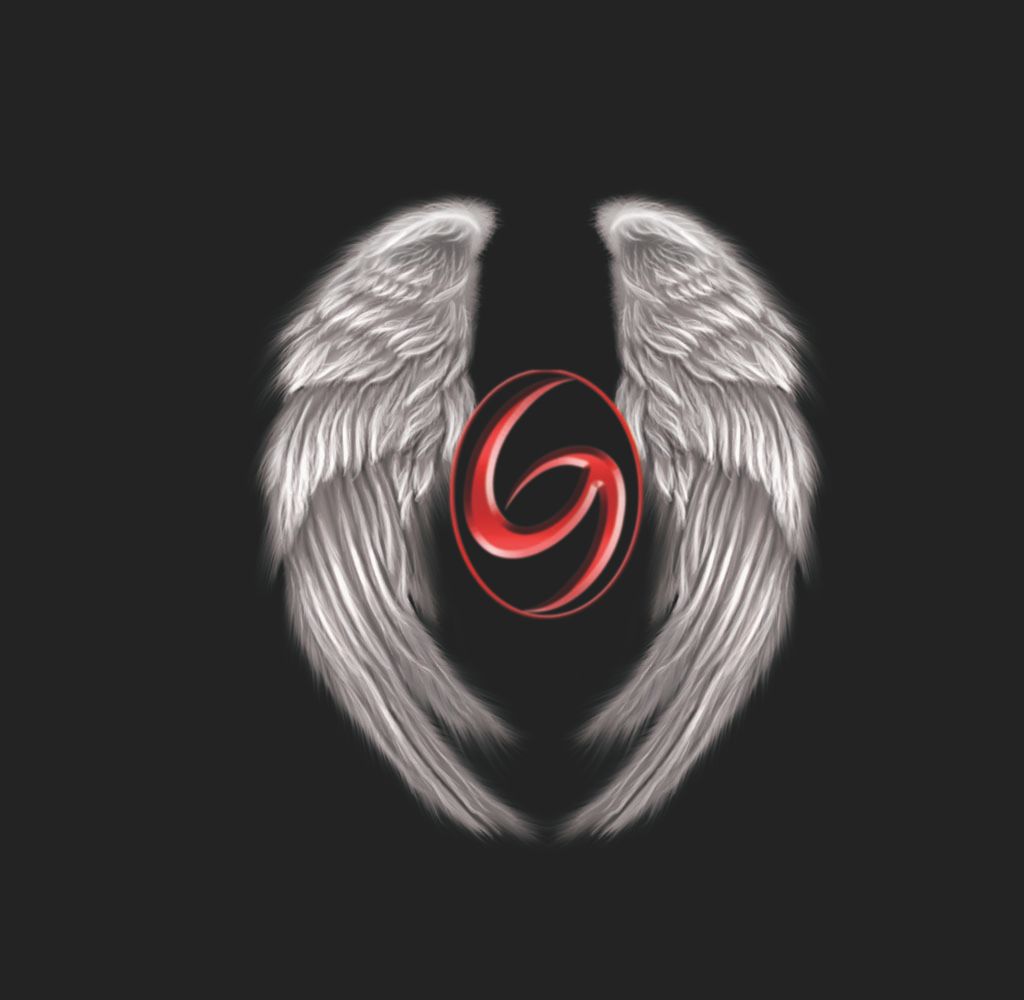
You are absolutely right. Didn't think about it. I like the new one also. gzMoebius wrote:I was trying to avoid wings that were spread out because of the limited width we'd have on the guild cloaks, the wider the image, the smaller it will shrink down to in order to fit widthwise on the cloaks.